Midterm Post:
Intro:
I started out with no photography experience whatsoever. The first and last time I had picked up an HDRI camera in high school, I was immediately confused by even the settings on auto and gave up on taking pictures when I realized I spent an entire thirty minutes taking pictures of my Principal with the lens cap on. Good times!
Black and White:
I've always liked the graffiti around my apartment and some of it shows some wit. There's a permit parking sign just outside another apartment that someone vandalized, and I thought the design was simple and effective; the meaning was easily understood even with judicious cropping, so I figured it would work for an assignment where most of the subject would be coming off the edge.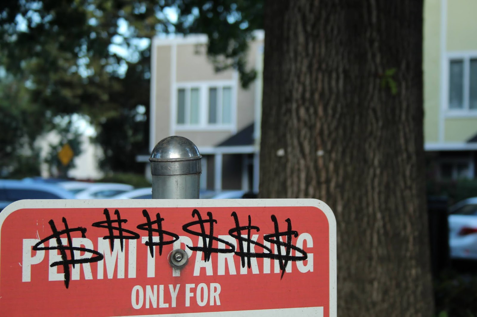

Things:
I didn't have anything particularly compelling in my apartment, so I went out into the campus rec centers for better subjects. After some unsuccessful attempts at capturing a pool game that just made me feel annoying for disrupting a game in progress, I decided to go to the unoccupied foosball table. I managed to get a well-centered shot of the 'players' with the most prominent one in the center. While I could've manipulated the objects a bit more to get a more centered shot, I like how dynamic it turned out, especially the ones in near profile on the right coupled with the slightly off-center players in the center.
Editing was simple, I made the highlights stand out more using masks, and made adjustments to the colors in order to get a more balanced histogram, adding in the yellows until the cream tone of the white players stood out more. I had to be careful manipulating the darks, as if I pushed anything too far it would just become pitch black and look really artificial.

HDR:
I'd taken a number of great looking HDR pictures, only to find out that my camera was automatically merging them. So I got beautiful, dynamic, colorful photos that I could do exactly nothing with. Once I had finally figured out how to get it to work properly, I was well past the golden hour, and didn't have anything to show for it. I settled for taking a zoomed in picture of my countertop, which was predictably messy and ridiculous, since I thought the clutter would at least create some good shapes. I focused on capturing the appearance of the faucet the most, since the reflections on the metal looked nice in HDR and produced some interesting shapes and textures that I hadn't captured yet.
This does not use HDR very well, and I had difficulties editing the photo to my liking; the picture is heavily tilted towards yellow and all adjustments had to be made with that in mind. I tried to push in reds and greens while muting the yellows in order to get a more balanced photograph, but this was unsuccessful and it resulted in some aspects of the image becoming muddy; I'm not too thrilled about the grey blob in the back that has no counterpart in reality. I know my room is gross, but trust me, it's not that gross. I would've also done some spot dodging/burning in order to add greater, more directed contrast onto the pipe itself and exaggerate the reflections.


Panorama:
I went for a path by the railroad tracks as my subject, with a special emphasis on the sign. Most editing work went into masking and spot correction, using content-aware fill and spot healing to fill in sections that would otherwise appear warped or missing due to perspective. This would be the largest project I have done in photoshop at full size, and I still wish I could've done more with it. The green sin the photograph deserved better channel manipulation so that they could stick out more; this would've made my focal point (the sign) a bit more obvious. As of right now, the only thing that separates it from the background is the shadows, which are not effective and only obscures visual data. However, the picture's histogram was already quite balanced, and I didn't want to make the same mistake I made with the HDR lab.


Comments
Post a Comment