Posts

Final Post:

Image
 Tiling:     Tiling felt great. While I understood that photography had its place as part of Matte painting and references for illustrations, I never really grasped how important it was to the AAA look until I actually saw the normal-mapped texture pop up in Unity, this is one of a few projects that were kind of a mental breakthrough for me.       For shooting, I went out on an overcast day and decreased my shot-timer/increased my aperture to make the image as dark as possible. I took a few brighter pictures when the sun came out just because I didn't quite understand the assignment at that point and figured brighter = more detail = better, but I ultimately preferred the look of the darker texture when both were lit in the renderer, proving the video correct.  I used the crop -> duplicate -> offset top layer -> clipping mask top layer -> blend, erase, and spot heal method to create tiling textures, removing distinctive elements like rocks and twigs on the edges of the t

Midterm Post:

Image
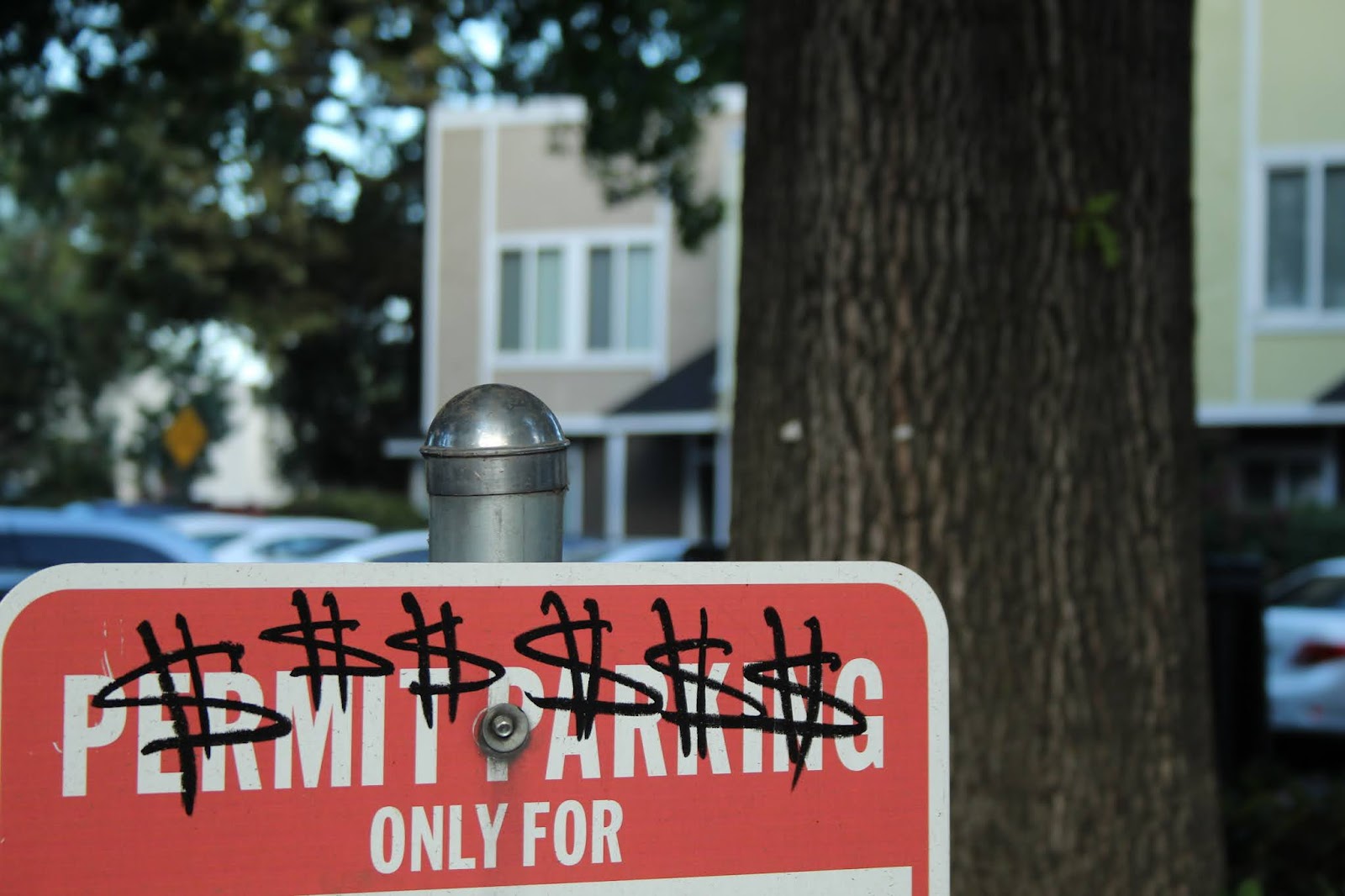
 Intro:     I started out with no photography experience whatsoever. The first and last time I had picked up an HDRI camera in high school, I was immediately confused by even the settings on auto and gave up on taking pictures when I realized I spent an entire thirty minutes taking pictures of my Principal with the lens cap on. Good times! Black and White:     I've always liked the graffiti around my apartment and some of it shows some wit. There's a permit parking sign just outside another apartment that someone vandalized, and I thought the design was simple and effective; the meaning was easily understood even with judicious cropping, so I figured it would work for an assignment where most of the subject would be coming off the edge.     I took the photo knowing that I wanted the sign to be the most prominent element without much distracting from it. When editing, most of my edits were made to the sign itself, my focal point, lightening up the text and darkening the graffiti